The Deliverable
About the Project
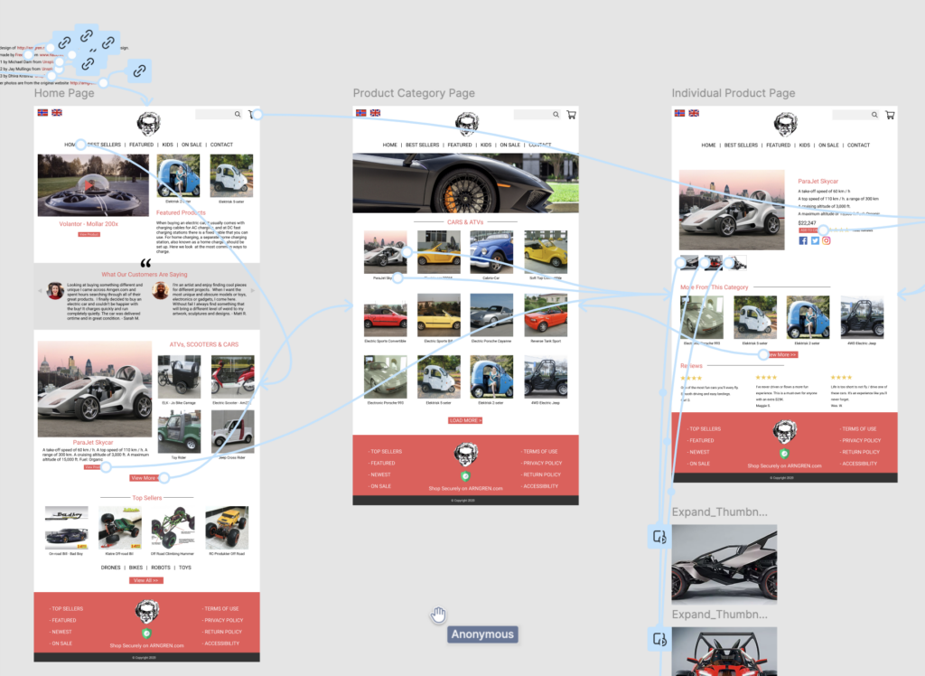
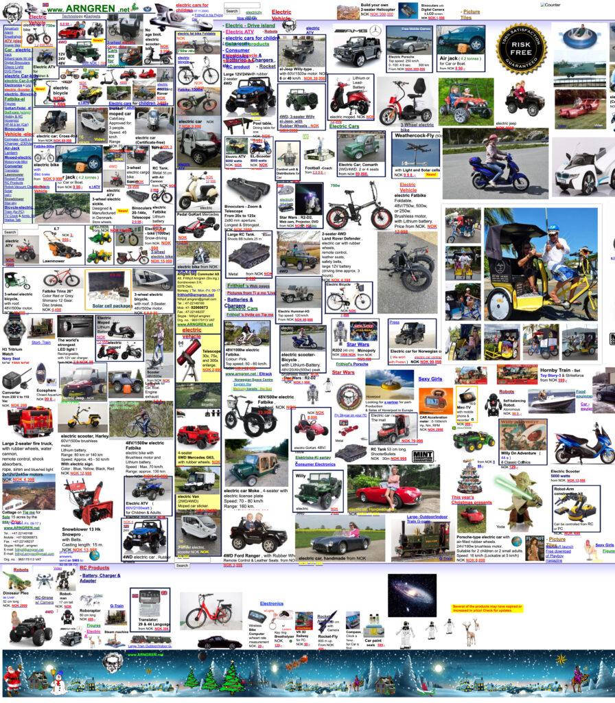
As a part of my undergraduate studies I was challenged to redesign and improve the user experience on www.Arngren.net allowing for a more clear structure of navigation, product presentation, and ultimately a better UX for the checkout process. The existing website offered hobby products ranging from toy model cars and helicopters to scooters, to bikes, ATVs, and even cars. Other product lines include electronics like Skype phones, remote control planes, and drones.
The site’s structure was messy and not mobile-friendly. Many images are not high enough quality and seem spammy. This confusion of cluttering all products together leaves users feeling lost. The path to purchasing one of these items was unclear as well causing a loss in sales because the final step was a wire transfer from your bank account to the owner’s bank account. All of this causes a loss of trust from the customer.
The Theories & Solution
Universal Design Theory: I’m passionate about ensuring that any website is accessible and user-friendly for everyone. By focusing on inclusivity, the design accommodates users of all abilities, making the site intuitive and easy to navigate, while providing a seamless experience across various devices and user contexts.
User-Centered Design (UCD): Focusing on the needs and expectations of the users, I applied User-Centered Design principles to streamline the website’s layout and functionality. The new navigation flow was designed with the user in mind, offering intuitive paths to explore products and make purchases. Every element of the redesign was crafted to be easy to use and engaging, ensuring that users feel comfortable and confident throughout their visit.
Reducing Cognitive Load: To reduce cognitive overload, I simplified the design and eliminated unnecessary clutter. By organizing content logically and prioritizing key information, I created a layout that allows users to process information more easily. The redesign minimizes distractions, enabling users to focus on their tasks—whether that’s finding information or completing a purchase—without feeling overwhelmed.
The Process
The new version of the website could arguably be seen as not quirky enough, interesting, or fun. It’s difficult when you want to be cheeky vs spammy. My goal in this rebuild was to allow the products to showcase the unique flair of the brand while maintaining proper design elements, common icons, and a minimalist layout structure for improved UX and ultimately conversion.
The overall deliverable of the project was a rationale and a medium-fidelity prototype of the new e-commerce design created in Figma. To make it even more improved I would have spent more time trying to incorporate the existing personality of the site.


