Deliverables
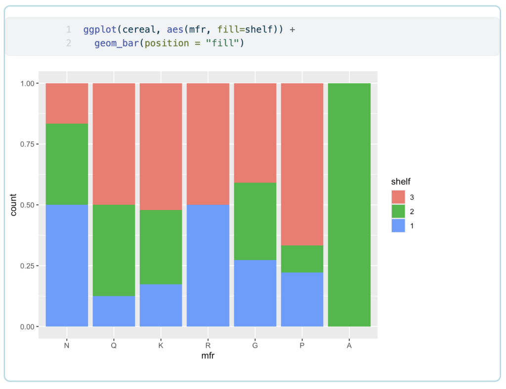
Using ggplot & geom_bar () with fill to better understand relationships between data.
The Challenge
The Process
To approach this assignment, I worked through a step-by-step process using RStudio to write the necessary code for generating visualizations. I began by analyzing the dataset, identifying key variables to highlight, and determining which types of visualizations would best represent the relationships between these variables. Using R’s plotting functions (such as ggplot for advanced visualization), I crafted code that processed the data and visualized it in meaningful ways. At each stage, I tested different variables and visualizations, refining the outputs to ensure they accurately represented the data and were easy to interpret. This iterative process allowed me to explore various visualizations, including scatter plots, bar charts, and even more complex 3-variable visualizations.


